React Native gives developers the layout, styling, window-dimension, platform, appearance, and accessibility tools needed to build adaptable mobile interfaces. It does not make an app responsive automatically: you still need to decide how components resize, reflow, change structure, respect platform conventions, and remain usable as the available space changes.
Quick Take
Start with flexible layouts, react to the current app window when structure needs to change, and keep your visual identity in reusable design tokens and components. A responsive React Native app should adapt to the space it actually has rather than assume every user has the same phone dimensions.
What Responsive Design Means in React Native
A responsive React Native interface remains usable when the space available to the app changes. That is broader than making buttons or images slightly larger on a bigger screen. A well-adapted interface may reflow content, add columns, move navigation, expose secondary information, or reduce visual density according to the available space.
This distinction matters because the app window is not always fixed for the lifetime of a session. React Native’s Dimensions documentation explains that dimensions can change because of conditions such as device rotation and foldable devices, so rendering logic that depends on them should not assume the first measured size will remain valid.
For example, a product screen might use a single vertical list on a narrow phone. On a wider tablet window, the same app could display the list on the left and the selected product details on the right. The branding and features remain consistent, but the information architecture adapts to the available space.
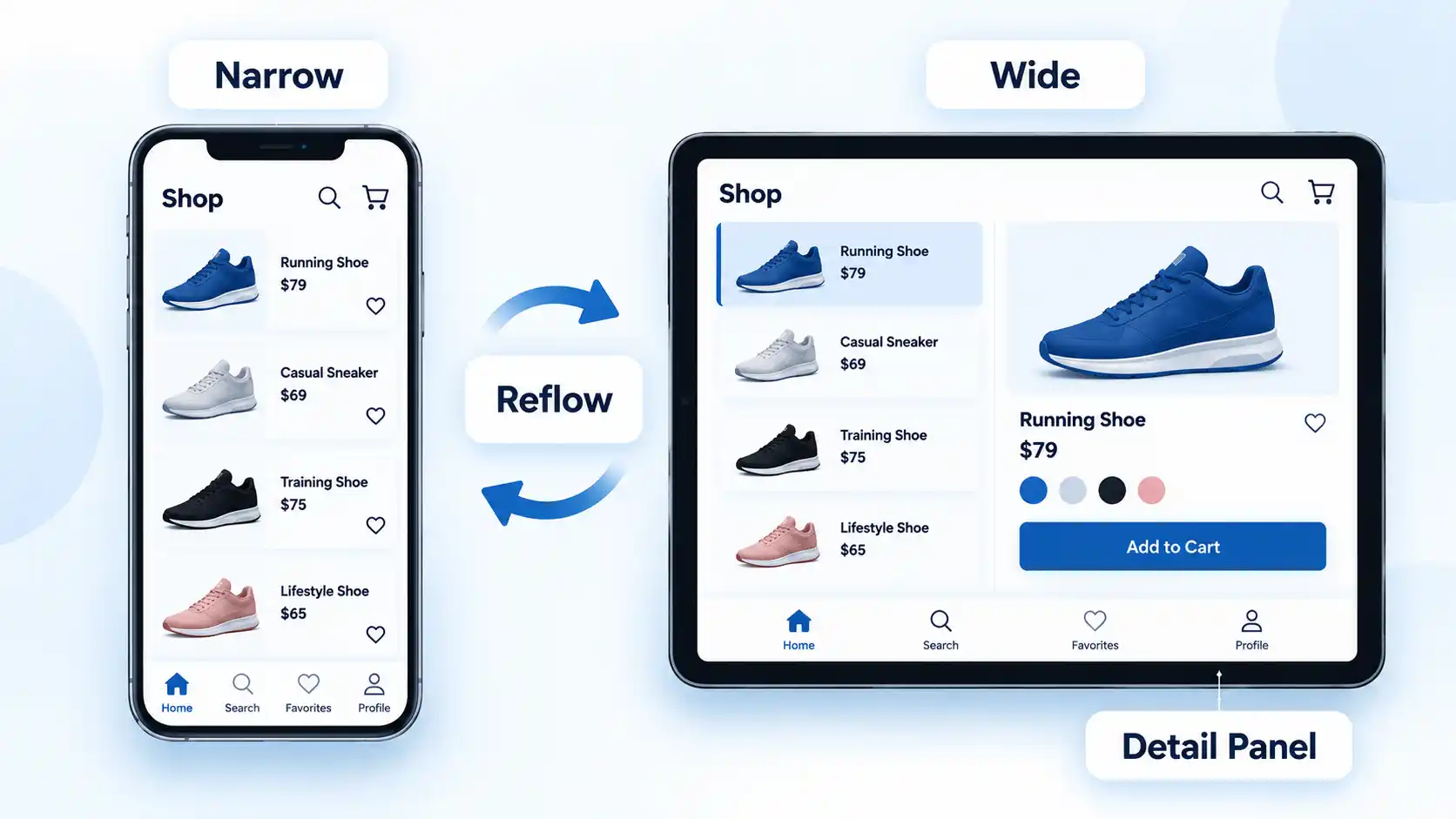
The useful measurement is usually the space the app currently occupies, not a marketing label such as “phone” or “tablet.” A larger device does not guarantee that the app always has a wide window, and orientation or resizable-window states can change the usable space during a session.
For deeper layout-specific work, responsive layout patterns for phones, tablets and foldables are most useful when they describe how the same content changes structure at different widths rather than simply enlarging every element.
Build the Layout From Flexible Primitives
Flexbox should handle much of the routine resizing before you introduce explicit width conditions. React Native uses the Flexbox algorithm so child components can share, align, wrap, grow, and shrink within the available area. Its official Flexbox documentation describes the system as a way to provide consistent layouts across different screen sizes.
The familiar concepts include flexDirection, justifyContent, alignItems, flexGrow, flexShrink, flexBasis, and flexWrap. These properties let a layout respond naturally to available space instead of relying on fixed coordinates for every component.
React Native’s Flexbox model is similar to web CSS, but the defaults are not identical. For example, flexDirection defaults to column rather than row, and flexShrink defaults to 0 rather than 1. Developers moving from web development should account for those differences instead of assuming browser defaults apply unchanged.
Consider a screen with a header, a scrollable content region, and an action area. The content region can take the remaining space while the header and action controls keep the room they need. If cards need to move onto another line, wrapping can often solve that without device detection.
Percentage-based dimensions are available for supported layout properties, but percentages alone are not a responsiveness strategy. They do not tell the app when a one-column information structure should become two columns, whether a secondary panel should appear, or how navigation should change. Start with flexible layout behavior, then introduce structural decisions where the content actually requires them.
React to the Available Window, Not a Device Name
When the structure of a screen genuinely needs to change, use the current window dimensions as an input to that decision. React Native’s useWindowDimensions documentation says the hook automatically updates its values when screen size or font scale changes.
This is safer than reading a width once, storing it as a permanent constant, and assuming the application will never be resized. A component can instead evaluate the current width while rendering and select an appropriate layout.
For example, a narrow window could render an inbox as a message list that opens each message on a separate screen. A wider window could render the message list and selected message beside each other. The breakpoint is a project-level design decision rather than a universal React Native number. Choose it where the actual content stops fitting comfortably.
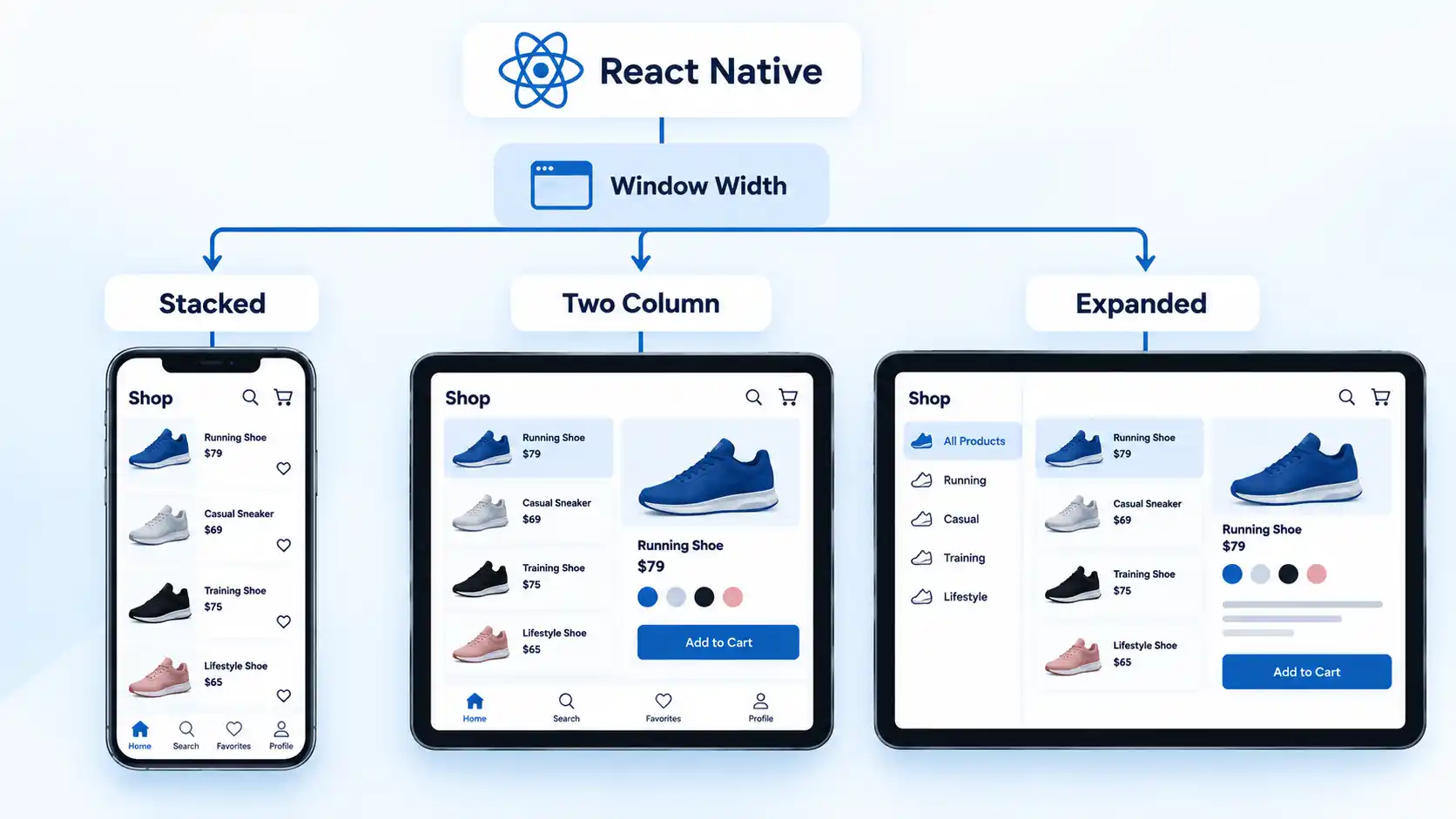
The same principle helps with rotation, foldable state changes, and other environments where the app window can be resized. You are responding to the space the app currently occupies rather than trying to infer layout solely from the device model.
If an interface works initially but breaks after resizing, rotation, or a fold-state change, React Native layout failures after rotation or window-size changes usually need to be investigated as constraint and state-update problems rather than patched with more device-specific constants.
Create a Distinctive UI With a Consistent Design System
Responsive behavior solves only one part of interface quality. A distinctive app also needs a recognizable visual system that remains coherent from screen to screen.
In React Native, styles are JavaScript objects passed through the style prop. The framework’s styling documentation explains that many property names and values resemble CSS, while property names use JavaScript-style camel casing and some behavior differs from the web.
For a growing application, avoid treating each screen as an independent design exercise. Define reusable decisions for typography, spacing, colors, corner radii, borders, elevation, and component states. These values are often called design tokens: named design decisions such as a standard spacing unit or semantic error color that multiple components can share.
A practical system might include reusable components such as PrimaryButton, Card, FormField, and SectionHeading. Their appearance can change through variants instead of duplicating styling throughout the application. This makes broad design changes easier to apply consistently.
StyleSheet.create() can help organize named styles, and React Native documents static type checking against supported native style properties as its main practical benefit. It is an organizational tool, however, not a design system by itself.
System appearance can also be incorporated deliberately. React Native’s Appearance API exposes appearance preferences such as the user’s light or dark color scheme. A theme layer can map that preference to semantic colors while preserving the same component vocabulary and visual identity.
Preserve Platform Conventions Without Duplicating the Whole App
Cross-platform development does not require every pixel and interaction to be identical on Android and iOS. Consistency is useful where the same behavior makes sense, but platform-specific differences can be appropriate when the operating systems expose different APIs or interaction conventions.
React Native explicitly supports these differences. Its current platform-specific code guidance documents both the Platform module for smaller conditional differences and platform-specific file extensions such as .ios and .android for larger variations.
That means a shared card, typography scale, data model, and business rule can remain common while a small platform-specific implementation changes where necessary. The objective is a coherent product, not artificial uniformity.
This also explains why “one codebase” should not be interpreted as “no platform-specific work ever.” React Native can reduce duplication, but platform APIs, dependencies, native integrations, and specialized interactions may still require targeted code.
The broader role of React Native for mobile app development is therefore best understood as sharing implementation where it is useful while retaining platform-specific behavior where the application requires it.
Handle Safe Areas, Accessibility and User Settings
A layout is not successfully responsive if it rearranges itself but leaves important content obscured, difficult to read, or inaccessible. Safe areas, assistive technologies, font scaling, and appearance preferences belong in the same quality discussion as width and orientation.
Safe areas help keep content away from screen edges and regions occupied by system interface elements or physical screen features. The core React Native SafeAreaView documentation now marks that component as deprecated and directs developers to react-native-safe-area-context instead.
Accessibility also requires explicit implementation. React Native provides APIs that integrate with assistive technologies such as VoiceOver on iOS and TalkBack on Android. Its accessibility documentation covers properties for labels, roles, states, actions, and other semantics, while noting that implementations can vary between Android and iOS.
A common failure appears when an interface looks correct at the default text size but text expansion causes labels to clip, buttons to overlap, or important controls to move outside the visible area. Another occurs when an action near a screen edge is positioned without accounting for safe-area constraints. These are usability defects even when the nominal screen width looks acceptable.
Test the design with enlarged text, relevant screen-reader workflows, light and dark appearance settings, and different safe-area conditions rather than treating accessibility as a final visual polish pass.
Should You Use a React Native UI Library?
A UI library can reduce repetitive component work, but it does not make an application responsive automatically. You still need rules for information hierarchy, window-width changes, component density, platform behavior, and accessibility.
React Native Paper is one current example. Its project describes it as a Material Design library for React Native and documents components intended to support native-looking interfaces and accessibility. It can be useful when its component and design model fits the product, but its defaults still need to be integrated into the application’s own layout rules.
Older articles frequently recommend NativeBase. That guidance now needs qualification because the NativeBase project repository explicitly marks the library as deprecated and in maintenance mode, directing developers starting new projects toward gluestack-ui.
gluestack-ui uses a different model in which developers can choose customizable components and bring their source into a project rather than relying only on a fixed pre-packaged component dependency. Its current documentation also exposes layout components, theme configuration, accessibility guidance, and responsive hooks. Whether that approach suits a project depends on how much ownership and customization the team wants over its component system.
If you are choosing between modern component-system approaches, React Native Paper and gluestack-ui differ in how they approach component ownership, design conventions, and customization, so the choice should follow the application’s design requirements rather than popularity alone.
Teams that plan to outsource implementation can also compare specialist React Native development companies, but a service-provider directory should be treated as a sourcing tool rather than evidence for technical design decisions.
Common Responsive-Design Mistakes
Most responsive problems come from assumptions that hold on the developer’s primary test device but fail as soon as the window, content, platform, or user settings change.
- Using fixed widths and heights everywhere: fixed values are useful in specific places, but making the whole interface depend on one expected screen size creates unnecessary overflow or unused space.
- Reading dimensions once and caching them: the app window can change during a session, so components that depend on width should respond to current dimensions.
- Treating percentages as the complete responsive solution: percentages can resize elements, but they do not decide when information architecture should change.
- Designing around device names: device categories do not always describe the actual window available to an app.
- Forcing Android and iOS to look identical: shared branding does not require ignoring platform-specific behavior or APIs.
- Ignoring safe areas: controls near screen edges can conflict with system interface regions or physical display constraints.
- Testing only the default text size: enlarged text can expose clipping, wrapping, and reachability problems that are invisible at default settings.
- Choosing a UI library before defining the product’s design rules: a component package can accelerate implementation, but it should support the design system rather than become the design strategy.
Practical Test Matrix Before Release
Responsive behavior should be validated through observable states rather than assumed from one successful emulator run. The matrix below focuses on conditions likely to expose hidden layout assumptions.
| Condition | What to inspect | Typical failure |
|---|---|---|
| Narrow phone window | Wrapping, navigation, text width, touch targets, and scrolling | Controls collide or content requires unintended horizontal space |
| Wide phone or tablet | Maximum content width, column structure, whitespace, and information density | The narrow-screen layout simply stretches and becomes difficult to scan |
| Portrait and landscape | Reflow, height constraints, modal placement, and keyboard interaction | A layout that fits one orientation overflows or becomes awkward in the other |
| Resizable window | Live width changes and conditional layout transitions | The interface keeps the layout selected at startup |
| Foldable state change | Window updates, content continuity, and structural transitions | Cached dimensions leave content clipped or incorrectly positioned |
| Large text or increased font scale | Labels, headings, buttons, navigation, and flexible container height | Text clips, overlaps, or pushes essential controls out of reach |
| Light and dark appearance | Semantic colors, contrast, icons, imagery, and component states | Hard-coded colors make text or controls difficult to distinguish |
| VoiceOver or TalkBack | Reading order, labels, roles, states, and actionable controls | The visual hierarchy works but assistive technology cannot interpret or operate key controls |
| Android and iOS | Platform-specific interactions, spacing assumptions, safe areas, and native behavior | A shared implementation ignores a platform-specific requirement |
After implementing the responsive behavior, use the following observable checks to confirm that the layout still works under the conditions above.
Verify the result
- Important content remains readable and reachable at both narrow and wide window sizes.
- Changing orientation or resizing the app causes the intended layout to update without requiring a restart.
- Increasing the system text size does not clip labels, hide controls, or make essential actions unreachable.
- Interactive elements remain usable with the platform’s screen reader and expose meaningful labels, roles, and states where relevant.
- Safe-area and platform differences do not place essential content beneath system interface regions.
Conclusion
React Native provides strong primitives for adaptable application interfaces, but good responsive design still depends on deliberate engineering. Let Flexbox handle routine space distribution, react to the current window when the information structure must change, keep visual decisions centralized in reusable components and tokens, and allow platform-specific behavior where the application requires it.
The result should not be an interface that merely fits more screens. It should remain understandable, operable, recognizable, and accessible as its available space and operating conditions change.







💬 Comments