Great presentations aren’t “natural talent”—they’re designed systems. About 77% of people fear public speaking, but research confirms public speaking anxiety is reducible through cognitive–behavioral techniques and deliberate preparation. And since around 90% of pre-presentation anxiety stems from lack of preparation, your best investment is rehearsal and structure—not last-minute slide tweaking.
Why presentations fail (and what to fix first)
Most presentation advice focuses on charisma or “being yourself,” but the research suggests something more actionable: preparation, cognitive load management, and audience engagement drive outcomes more reliably than personality type.
If you’ve been told “you’re either a natural speaker or you’re not,” ignore that. The constraint isn’t talent—it’s whether you’ve designed a system you can execute under pressure.
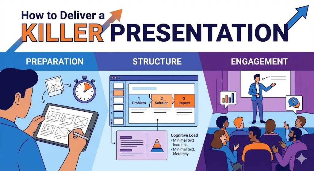
Step 1: Build a narrative structure (not just slides)
Your slide deck is a script, not a data dump. A strong narrative does three jobs: it focuses your prep, it guides the audience’s attention, and it makes your content memorable. According to presentation engagement research, 65% of TED Talks that went viral included personal stories, and 90% of respondents say narrative is important for engaging the audience.
How to structure your story
- Problem–Solution–Impact: Open with the problem your audience cares about, present your solution, and close with measurable impact or next steps.
- Before–During–After: Show the starting state, the transformation process, and the outcome (especially effective for case studies).
- Question–Data–Answer: Pose a question the audience wants answered, present data/evidence, and deliver the conclusion.
Whichever structure you pick, document it in a presentation brief template before you open your slide software so you’re not “designing by accident.”
Step 2: Design for cognitive load (not visual polish)
Your slides compete with the audience’s working memory, which has strict capacity limits. According to cognitive load research, the brain processes visuals 60,000 times faster than text, but working memory still bottlenecks—so strategic visual hierarchy reduces extraneous cognitive load by removing clutter and distraction.
Practical cognitive load checklist
- One idea per slide: If you need two headings on one slide, you need two slides.
- Visual hierarchy: Use size, contrast, and spacing to guide attention (largest/boldest = most important).
- Minimal text: Aim for 6–8 words per slide; anything longer should be spoken, not written.
- Complementary visuals: Use diagrams/images that clarify (not decorate); avoid stock photos that add zero information.
- Consistent layout: Stick to 2–3 slide templates max; layout changes create extraneous load.
If you’re managing a design system for recurring presentations, centralize your templates and cognitive load guidelines in a shared presentation design system so your team doesn’t reinvent slides every time.
Step 3: Start with a hook (specific, not generic)
How you open determines whether your audience stays engaged or mentally checks out. The most reliable opening patterns:
- Relevant statistic or fact: Use a number tied to your audience’s reality (industry benchmark, cost impact, failure rate).
- Provocative question: Ask something the audience wants answered but hasn’t articulated yet.
- Unexpected observation: Challenge a common assumption in your field with evidence.
- Brief story (under 60 seconds): Set up the problem with a real scenario your audience recognizes.
What NOT to do: Don’t open with “thanks for having me,” agenda slides, or your company history unless explicitly required by context.
Step 4: Weave in interaction (don’t save it for Q&A)
Traditional presentations treat the audience as passive receivers, but research shows interactive formats dramatically improve outcomes. According to the same engagement research cited earlier, presentations with two-way interaction persuade 65% of people more easily, and 68% believe presentations with interactive elements are more memorable.
Interaction tactics (before, during, after)
- Live polls: Use quick polls (show of hands or digital tool) to validate assumptions or surface opinions mid-presentation.
- Real-time questions: Pause after key sections and invite clarifying questions (don’t wait until the end).
- Audience examples: Ask the audience to share quick examples from their context that map to your framework.
- Decision points: Present two options and let the audience vote on which path to explore deeper.
If you run recurring webinars or training sessions, capture your best interaction patterns in a interactive presentation playbook so you can reuse what works.
Step 5: Manage eye contact and presence (even with slides)
If you’re presenting with a large screen or monitor, it’s tempting to turn away from the audience and read your slides. That breaks connection and signals you’re not confident in your material.
Practical presence tactics
- Memorize your opening and closing: The first 60 seconds and last 30 seconds should require zero slide reference.
- Use presenter notes (but don’t read them): Notes are prompts, not scripts; glance, then speak.
- Practice slide transitions: Know what’s coming next so you’re not surprised by your own deck.
- Scan the room: Make brief eye contact with different sections (don’t stare at one person or one corner).
Step 6: Close with clarity (not vague “thanks”)
Your closing slide should do one job: tell the audience exactly what happens next. Weak closings (“Any questions?”) waste the moment when attention is highest.
Strong closing patterns
- Explicit next step: “Email me by Friday if you want access to the data.”
- Single takeaway: “Remember: test your hypothesis before you scale.”
- Decision frame: “You now have three options—here’s how to choose.”
- Open-loop question: “What would change in your workflow if you applied this tomorrow?”
After your closing statement, invite questions or comments—but don’t let Q&A replace your conclusion.
Preparation checklist (what to do before you present)
- Write your narrative structure (problem–solution–impact or equivalent) before opening slide software.
- Design slides for cognitive load: one idea per slide, visual hierarchy, minimal text.
- Rehearse transitions and timing out loud (not just in your head).
- Identify 2–3 interaction points where you’ll pause for audience input.
- Memorize your opening hook and closing takeaway.
- Test your setup (screen resolution, audio, backup plan if tech fails). If your presentation includes high-resolution visuals, video demos, or real-time simulations, make sure your hardware can handle it reliably—many presenters use performance-oriented machines such as Lenovo Intel gaming PCs to avoid lag or rendering issues during live sessions.
Troubleshooting (common failure modes)
- “I ran out of time and skipped key slides.” You over-packed. Cut 30% of your slides and rehearse the shorter version with a timer.
- “The audience looked bored.” Check cognitive load (too much text?), pacing (monotone delivery?), and interaction (did you give them anything to do?).
- “I forgot what I was going to say.” Your slides aren’t prompting you effectively; add a single keyword or image to each slide that triggers your talking points.
- “Questions derailed my flow.” Set boundaries: “Hold detailed questions for the end; quick clarifications are fine now.”
Key takeaways
- Presentation skill is learnable: 90% of anxiety comes from lack of preparation, not lack of “talent.”
- Design for working memory limits: one idea per slide, clear hierarchy, minimal text.
- Interaction beats passive listening: 65% more persuasion, 68% more memorability when you involve the audience.
- Story structure focuses your prep and guides audience attention better than slide-by-slide design.
FAQ
How many slides should I use?
Aim for roughly one slide per minute, but prioritize pacing over slide count. If a slide takes 3 minutes to unpack, that’s fine—don’t split it arbitrarily.
Should I memorize my entire presentation?
No. Memorize your opening (60 seconds), closing (30 seconds), and key transitions. Everything else should be guided by your slides and rehearsal.
What’s the best way to handle nerves?
Rehearse out loud multiple times, use deep breathing before you start, and focus on your first sentence (once you start, momentum takes over).
How do I make slides “look professional”?
Professional = clear hierarchy + consistent layout + high contrast + minimal text. Avoid decorative elements that don’t clarify your point.
Should I use animations or transitions?
Only if they reveal information progressively (e.g., showing one bullet at a time to control pacing). Avoid decorative animations—they add cognitive load.
What if someone asks a question I can’t answer?
“Great question—I don’t have that data here, but I’ll follow up after” is always acceptable. Don’t invent answers.
How do I practice if I don’t have an audience?
Record yourself on video, present to a colleague, or use a mirror. The goal is to hear yourself speak the words out loud multiple times.
Is it okay to read from my notes?
Brief glances are fine; continuous reading breaks connection. Use notes as prompts, not scripts.
💬 Comments