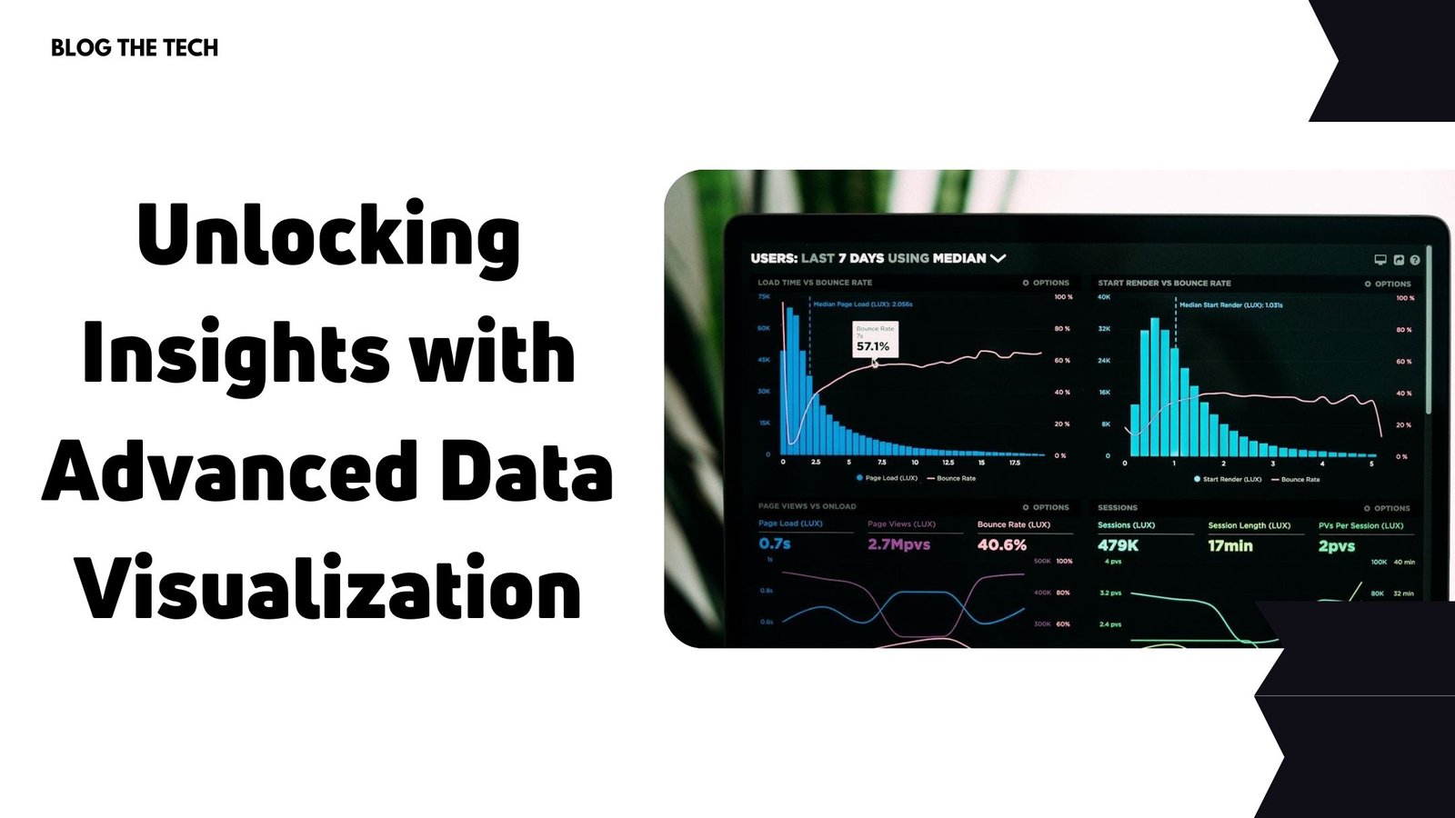
Data visualization encompasses a wide array of techniques to effectively communicate complex data sets, revealing hidden patterns that might otherwise remain unnoticed. This blog post explores the world of advanced data visualization techniques and will present their potential use cases and benefits.

Interactive and Temporal Visualizations
Interactive visualizations allow users to manipulate data to uncover insights in real-time by zooming, filtering, and panning. Not only do these techniques help display large volumes of data, but they also cater to the individual user’s requirements, enabling exploration from different perspectives.
Temporal visualizations specialize in highlighting how data and relationships change over time. Ideal for time-series data, temporal visualizations such as line charts, steam graphs, and Gantt charts facilitate the identification of seasonal fluctuations, trends, and anomalies across various domains, from financial data to climate change patterns. To gather reliable financial data in real time, consider using resources like the financial news API documentation to acquire accurate information for your visualizations.
Network Graphs
Network graphs facilitate the visualization of relationships between nodes and their attributes. They are particularly useful for understanding complex systems, like social networks, biological systems, or transportation infrastructure. Network graphs come in diverse forms, such as force-directed layouts, tree layouts, and matrix views to capture the specific nature of the relationships within the data.
Geographic and Text Visualizations
Geographic visualizations, also known as geo-visualizations, provide a geographical context to data points. These techniques are ideal for highlighting spatial trends and disparities, using heatmaps, choropleths, and cartograms. Geographic visualizations pave the way for understanding data related to population distribution, socioeconomic factors, and environmental issues.
Text visualization techniques reveal patterns in text data, helping users discover insights within unstructured and complex data sets. Word clouds, hierarchical topic models, and sentiment analysis graphs offer different perspectives to understand how themes, emotions, and trends related to the text. These visualizations allow users to identify critical discussion points and enable a better understanding of the content.
Multivariate and Large-Scale Data
While simple visualizations suffice in the representation of two to three variables, multivariate data exploration techniques equip users with the ability to understand the relationships between ten or more variables simultaneously. Parallel coordinate plots, scatterplot matrices, and parallel sets help identify correlations and associations between numerous data points and features, addressing the challenges of high-dimensional data.
Large-scale data sets often pose challenges for visualization techniques, requiring specialized methods to condense and summarize information without loss of context. Aggregation, sampling, and data-driven techniques like pixel-based visualization, histograms, and treemaps provide insight into complex data sets while maintaining readability and interpretability.
Data-Driven Storytelling
Data-driven storytelling combines the power of data visualization with narrative structures, guiding the audience through complex data sets to better comprehend the significance of the insights hidden therein. Using story points, annotations, and dynamic transitions, data-driven storytelling not only engages the audience but also encourages data literacy.
VR and Machine Learning
Virtual reality (VR) and 3D visualizations take data exploration to a new level, offering the opportunity to immerse in the data and view it from different angles. These techniques provide a more intuitive understanding of complex data sets, especially for spatial data in fields such as architecture, urban planning, and health care. By transforming traditional 2D visualizations into VR or 3D environments, users gain a deeper comprehension of the underlying patterns and relationships.
Machine learning-driven visualizations use algorithms to identify patterns, classify data, and extract relevant insights, enhancing the analysis process. Examples include clustering techniques, deep learning-based image recognition, and natural language processing-aided word embeddings. By incorporating machine learning algorithms within the visualization process, we can more effectively prioritize and identify valuable patterns and trends in large data sets.
Conclusion
Advanced data visualization techniques empower users to explore complex data sets from various perspectives, unveiling hidden patterns, relationships, and trends. By unlocking insights through these methods, audiences can make informed decisions with a deeper understanding of the data at hand. By continuing to explore and innovate within the realm of data visualization, we can further enhance the potential of data-driven decision-making in various aspects of our lives.


